Abandoned History: The Current Buick Logo, Just One of Many (Part I)

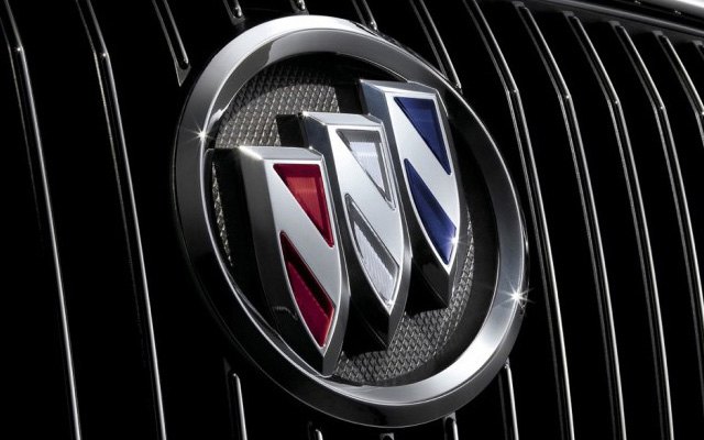
According to a recently filed trademark application, Buick’s familiar tri-shield logo may be going the way of the dodo. It’s been suggested the potential logo change is in pursuit of a revised image, in preparation for the Brave New World of EVs that Buick will soon unleash upon millions of eager customers. However, given the company has been around for over 120 years this is far from the first time Buick has swapped its badge.
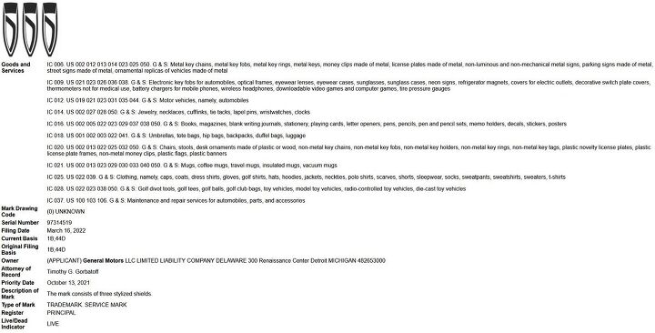
First, the reason you clicked. Shown here is an image pulled from the United States Patent and Trademark Office, where General Motors filed a Buick logo application on March 16th, 2022. Application 97314519 is filed under the Goods and Service category at the patent office. That category includes automobile trademarks, or “motor land vehicles,” in government-speak. Other potential goods to receive the Buick logo include key fobs, key chains, money clips, and even street signs. Walking down to Electra Avenue sounds better to me.
There are once again three “stylized” shields, but they’re a bit different than the Buick logo you’re used to. The shields go without an encompassing circle of any kind and are aligned horizontally instead of the traditional diagonal arrangement. Also missing from the trio of shields is a diagonal strake, replaced by a boomerang-type strake that starts at the upper left corner of each shield and finishes in the pointed lower end. Rotate the image to the left 180 degrees, and you end up with three electric razors.
Beyond that, there’s been much Internet Car Expert speculation over the last few days. Hastily rendered images starring the new logo on crossovers, on EVs like the Electra concept, and others. It’s unclear whether the logo will be monochrome, or trendy and lighted, or even if it will have the traditional red, white, and blue color scheme. And all that’s down to U.S. patents, which are filed strictly in black and white.
Buick made a statement to CarBuzz and told them to stop fishing, saying “Buick has no announcement to make in relation to speculative reports regarding a logo change.” But of course, that’s to be expected, can’t ruin the big reveal! The new logo would be the 17th in the company’s history, which is where the Abandoned History part of the headline comes good. Let’s talk about the early 1900s.
Buick officially produced its first vehicle in 1899, when the company was called Buick Auto-Vim and Power Company. The primary business of the company was fixed and marine engines, and Buick’s founder David Dunbar Buick wasn’t too sure about extending the business into automobiles. But Mr. Buick was interested in cars and ended up with some tasty financing from a gearhead friend. Buick Motor Company was established in 1903, and Buick created its first logo.
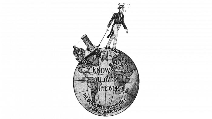
A non-traditional style, Buick’s initial branding featured an Uncle Sam character smoking a pipe and pulling a wagon across the globe. The tagline said “known all over the world,” with The Buick Motor Company scrawled across Antarctica, along with its Flint, Michigan home base. It should be noted that although this was Buick’s official logo, only script Buick lettering was used on its vehicles.
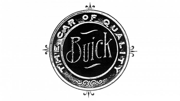
The globe logo only lasted for a couple of years and did not appear in all advertising. It was replaced in 1905 by a seal that did in fact show up on cars: A circular badge that read “The Car of Quality,” with the Buick name in the center. Some fleurs-de-lis decorated the north, south, east, and west points of the circle. The badge was made of brass and was placed atop the radiator grille on the Model C. It was used in conjunction with the Buick script grille lettering on other models, lettering most often in gold.
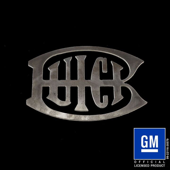
1911 saw the appearance of a very short-lived logo that was more stylized. A large capital B had u-i-c-k in the middle, all held up by a horizontal crossbar. It was sort of a belt buckle look. This logo was in use from 1911 to 1913 before it was replaced by a much more recognizable emblem.
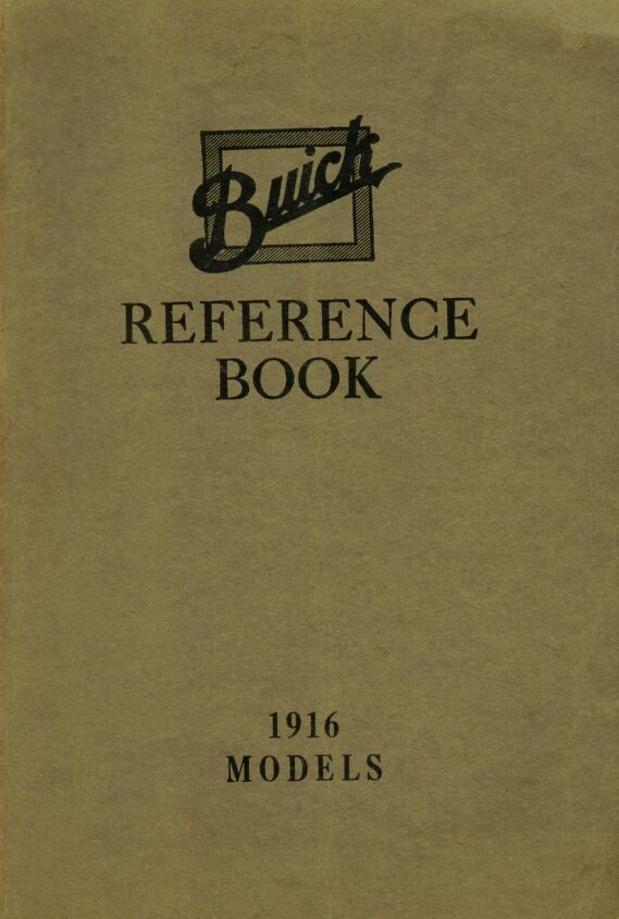
In 1913 Buick’s designers came up with a logo that integrated the scripted Buick font they’d been applying to their radiator grilles for years. It was the first of what might be considered a modern automotive emblem, as the script was depicted in white, over a white outer square and a blue inner square.
The appearance of the white and blue coloring was the start of a tradition at Buick. The company seemed satisfied with its new logo, as it kept it for much longer than its predecessors: All the way through 1935. It was with this new logo that the gold Buick script disappeared from grilles, and the company’s wares were represented only by the square logo. It was also around this time that Buick started using various stylized hood ornaments.
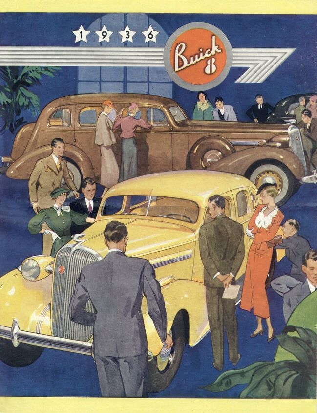
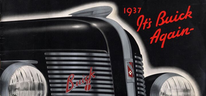
In 1936 a new logo arrived, and while looked a bit more ready for the 1940s but didn’t quite make it there. Buick script was modernized and still angled upward at 45 degrees, but was now white with a red background, and trimmed in chrome. Underneath the c-k of the logo was a stylized 8 in red and chrome. It was the era where cylinder count was important, and Buick needed onlookers to know its cars had eight cylinders.
Used concurrently with the Buick 8 stylized logo was the company’s first crest logo, which arrived in 1937. The symbol was the Buick family’s coat of arms, as interpreted via Buick’s designers. A Buick employee found an old book that described the family’s coat of arms but had no images, only a textual description.
The logo described included a red pentagonal banner, intersected by blue and white squares at a diagonal. Above the diagonal was a golden deer’s head, while below featured a cross. The company used the new logo to great effect on its fantastic Art Deco illustrations in ’37. The two logos were used together only in 1937, as for 1938 the new coat of arms logo took over.
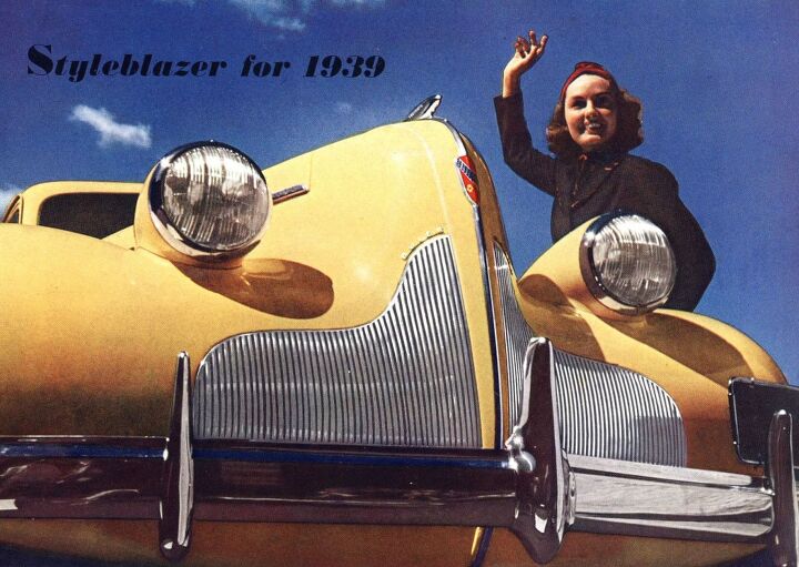
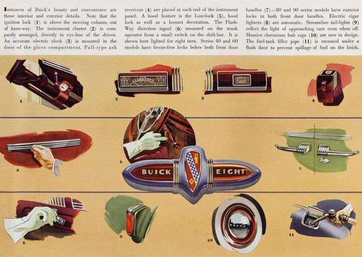
1939 brought with it a slightly revised version of the coat of arms logo, a more pointed interpretation of the same theme. The deer and cross were a bit more stylized than before, and the five-sided banner shape gave way to a more familiar look: Buick’s first shield. In some instances, the words Buick and Eight were represented to either side of the logo, like on interior trim.
As we approach the Forties, we’re a bit less than halfway through Buick’s logo story. The logo progression gets a bit more convoluted from here. More next time.
[Images: GM]

Interested in lots of cars and their various historical contexts. Started writing articles for TTAC in late 2016, when my first posts were QOTDs. From there I started a few new series like Rare Rides, Buy/Drive/Burn, Abandoned History, and most recently Rare Rides Icons. Operating from a home base in Cincinnati, Ohio, a relative auto journalist dead zone. Many of my articles are prompted by something I'll see on social media that sparks my interest and causes me to research. Finding articles and information from the early days of the internet and beyond that covers the little details lost to time: trim packages, color and wheel choices, interior fabrics. Beyond those, I'm fascinated by automotive industry experiments, both failures and successes. Lately I've taken an interest in AI, and generating "what if" type images for car models long dead. Reincarnating a modern Toyota Paseo, Lincoln Mark IX, or Isuzu Trooper through a text prompt is fun. Fun to post them on Twitter too, and watch people overreact. To that end, the social media I use most is Twitter, @CoreyLewis86. I also contribute pieces for Forbes Wheels and Forbes Home.
More by Corey Lewis
Latest Car Reviews
Read moreLatest Product Reviews
Read moreRecent Comments
- Varezhka I have still yet to see a Malibu on the road that didn't have a rental sticker. So yeah, GM probably lost money on every one they sold but kept it to boost their CAFE numbers.I'm personally happy that I no longer have to dread being "upgraded" to a Maxima or a Malibu anymore. And thankfully Altima is also on its way out.
- Tassos Under incompetent, affirmative action hire Mary Barra, GM has been shooting itself in the foot on a daily basis.Whether the Malibu cancellation has been one of these shootings is NOT obvious at all.GM should be run as a PROFITABLE BUSINESS and NOT as an outfit that satisfies everybody and his mother in law's pet preferences.IF the Malibu was UNPROFITABLE, it SHOULD be canceled.More generally, if its SEGMENT is Unprofitable, and HALF the makers cancel their midsize sedans, not only will it lead to the SURVIVAL OF THE FITTEST ones, but the survivors will obviously be more profitable if the LOSERS were kept being produced and the SMALL PIE of midsize sedans would yield slim pickings for every participant.SO NO, I APPROVE of the demise of the unprofitable Malibu, and hope Nissan does the same to the Altima, Hyundai with the SOnata, Mazda with the Mazda 6, and as many others as it takes to make the REMAINING players, like the Excellent, sporty Accord and the Bulletproof Reliable, cheap to maintain CAMRY, more profitable and affordable.
- GregLocock Car companies can only really sell cars that people who are new car buyers will pay a profitable price for. As it turns out fewer and fewer new car buyers want sedans. Large sedans can be nice to drive, certainly, but the number of new car buyers (the only ones that matter in this discussion) are prepared to sacrifice steering and handling for more obvious things like passenger and cargo space, or even some attempt at off roading. We know US new car buyers don't really care about handling because they fell for FWD in large cars.
- Slavuta Why is everybody sweating? Like sedans? - go buy one. Better - 2. Let CRV/RAV rust on the dealer lot. I have 3 sedans on the driveway. My neighbor - 2. Neighbors on each of our other side - 8 SUVs.
- Theflyersfan With sedans, especially, I wonder how many of those sales are to rental fleets. With the exception of the Civic and Accord, there are still rows of sedans mixed in with the RAV4s at every airport rental lot. I doubt the breakdown in sales is publicly published, so who knows... GM isn't out of the sedan business - Cadillac exists and I can't believe I'm typing this but they are actually decent - and I think they are making a huge mistake, especially if there's an extended oil price hike (cough...Iran...cough) and people want smaller and hybrids. But if one is only tied to the quarterly shareholder reports and not trends and the big picture, bad decisions like this get made.


















Comments
Join the conversation
Wouldn't You Really Rather Have a Buick?
I have a 1936 Buick on my property. It was driven down the road allowance until it either died or got stuck. The engine and glass are out of it and the body is riddled with bullet holes - some of which I installed. Great looking auld car.